This article and all of the images within were created by the very talented Melissa St. James. Copyright © Melissa St. James. Check out her gallery here.
Have you ever been frustrated with skin that looks flat in Daz Studio? Dull and lifeless? Rubbery with a distinct likeness to that of Gumby? (Google it if you’re too young to remember Gumby.) Or maybe it just needs a little bit of pop? Most of the time, any of these issues can be attributed to SSS, or subsurface scattering, and there are a couple easy tweaks that can be made to drastically improve the look of skin in Daz.
[Visit Part 2 of the tutorial which deals with Tweaking a Chromatic Skin.]
PBR Skin Shader vs Iray User Shader
Before we get started, I wanted to make a quick note regarding the new skin shader that was introduced with Genesis 8.1, the PBR Skin Shader (it can also be used on Genesis 8). ‘PBR’ is actually a technical term.
Physically Based Rendering, according to Wikipedia, is ‘a computer graphics approach that seeks to render images in a way that models the flow of light in the real world.’
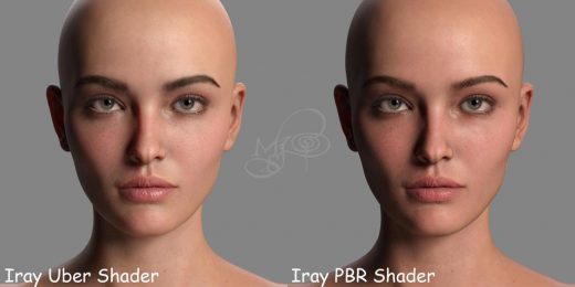
Okay, well that was kinda vague. Both the PBR Skin Shader and the Uber Shader do this, so they are both technically PBR shaders. They use almost all of the same maps. So please don’t let Daz’s play at words lead you to believe that the Uber Shader is somehow lesser. It’s just different. While the PBR Shader has added a couple neat new tricks, it is also missing some neat tricks that will be made use of in this guide. Essentially, the PBR Skin Shader is a trade-off, and it’s up to the user to decide which they prefer. Please see the below comparison with Victoria 8.1.

It is so very much personal preference. Personally, I stick with the Uber Shader because it allows me to better control SSS. Now, if Daz were to update the PBR Shader to bring back the SSS capabilities that the Uber Shader gave us, then it would be the best of both worlds. But for the sake of this article, I will be sticking with the Uber Shader. (Another article may come at a later date that works specifically with the new Iray PBR Skin Shader.)
Spectral Rendering
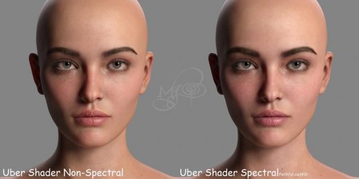
One other item of note is Spectral Rendering. A lot of folks don’t know what it is and a lot of folks don’t use it. Personally, I do, and I don’t. It depends on the scene and the skin I’m working with. It is supposed to be more actuate in terms of how it bounces light around the objects in the scene, some scenes more than others. The downside is that it has a particular tendency to make skin out of the box look like muddy, green, flat…blech. The tweaks I will be going over won’t work with Spectral Rendering. Well, they will…but they require different SSS settings to not look like muddy, green, flat…blech. It also can add exponentially to your render times, even with the same exact lighting.
Is it really worth it? That’s up to you to decide. Like I said, I’ve noticed that Spectral rendering works better with some skins than others. For the purposes of this article, due to length, I will be sticking with basic rendering. If folks enjoy this article, I will do a write-up of my tweaks translated to Spectral Rendering at a later date. For comparison, here is an example with Vicky 8.1 with my Iray Uber settings.

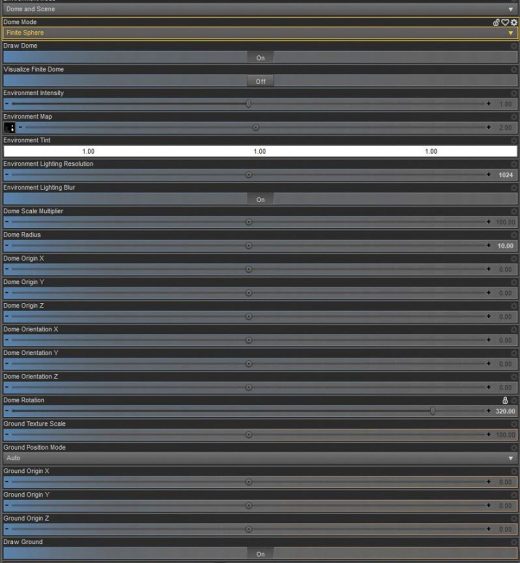
Okay! Ready to get started? Oh! I forgot to mention that if you want to follow along in Daz, I’m using this HDRI and no other lighting and default tone mapping.

Monochromatic vs Chromatic Iray Uber Skin
The first step is understanding what type of skin you are starting with, and that really boils down to SSS (subsurface scattering). To put it simply, think of subsurface scattering as the way light shines through the skin. Skin is translucent, so it’s only natural that we’d see things like veins and, well, meat beneath it. Older Iray Uber skins, such as those found on G3 and a very small amount of G2 characters, use a type of SSS called Monochromatic. Newer Iray Uber skins, such as those found on G8 (and G8.1) characters, use a type of SSS called Chromatic.
Now, what is the difference between the two? Well, I honestly couldn’t tell you, other than the fact that they behave completely differently, and that Chromatic SSS, when set up correctly, appears to behave more naturally in terms of light reflection than Monochromatic SSS. So how do you tell which is which? It’s really easy, but you’ll need to roll up your sleeves a bit and open up the surfaces tab (If you’re never looked at the surfaces tab, or are unfamiliar with it, you’ll be digging into it here!):
Monochromatic
You will see a greyscale map slotted into the translucency color. You’ll also see a rather tomato-inspired red set for the color itself (in most cases). And if you scroll down on the surfaces panel, you’ll see the word ‘Mono’ listed under SSS Mode.
Monochromatic skin typically uses a lower translucency weight (.3 to .5) and the general rule of thumb is that it can be lightened or darkened by adjusting that slider (lower for lighter, higher for darker, etc). Monochromatic skin can be converted to Chromatic skin with some work, and that work does involve Photoshop (or another photo editing program that can use layers, such as Gimp). I will be showing you how to convert a Monochromatic skin, such as Vicky 7, over to Chromatic SSS and apply my tweaks. (I’ll try to stick with the super popular base figures that pretty much everybody has so you can follow along exactly.)
Chromatic
You will likely see either an exact duplicate of the base color map slotted into the translucency color, or a slightly lightened version of the base color map. The translucency color itself should (in most cases) be white (this isn’t always the case for spectral rendering, but again, this article will only cover basic rendering). And if you scroll down on the surfaces panel, you’ll see the word ‘Chromatic’ listed under SSS Mode.
Chromatic skin typically uses a much higher translucency weight (.75 or higher) and it is harder to lighten or darken simply by adjusting. This can be tweaked slightly, but if you need to lighten or darken a skin drastically, I would recommend finding a different skin that starts out where you want it in terms of tone, or go the direct route of editing the maps manually in Photoshop (advanced users). The reason for this is that Chromatic skin relies on the translucency color map, or the ‘meat map’ as I call it, to shine through from beneath the outer base color layer. If you try to lighten the skin by dropping the translucency weight, you’ll lose that ‘meat’ and the skin will end up looking flat. Chromatic skins out of the box are the easiest to tweak because they already have the necessary SSS map (though advanced users can go even further and build a new SSS map or tweak the existing one for even more detail, something I will cover in another tutorial).
Converting Monochromatic SSS to Chromatic SSS
(Beginner Level in Photoshop Required)
- Open up a figure of your choice (I’m using Victoria 7 for my example) in Daz Studio.
- Open up the Surfaces tab.
- Starting with the Face, open up the translucency map in Photoshop (or photo editing program of your choice that supports layers). In the case of Vicky 7, this map is here on my system – DAZ 3D\My 3D Library\Runtime\Textures\DAZ\Characters\Genesis3\Victoria7\V7FaceMapSSS_1001.jpg. There are other SSS maps for Vicky 7 that are dependent upon any makeup you choose, but for our purposes, we’re only concerned with the base skin that loads with the character. You can always convert the makeup skins if you’d like later (I usually just use third-party makeup anyways).
- Once you have the Face SSS map open in Photoshop (it should be greyscale with blue squigglies), take a look at the vein detail. It’s great! I really wish Daz kept these details on their newer figures but c’est la vie. Now open up the base color map, in this case V7FaceMapD_1001.jpg. We’re going to need both to create a proper Chromatic SSS map.
- Next take the SSS map and copy/paste it onto a new layer over the base color map. You should now have two layers…one with the SSS map, and one with the base color map. The SSS map should be on top, currently blocking the color map from showing.
- Change the opacity of the SSS map to 25%.
- Now create a new solid color adjustment layer and pick a nice fleshy pink tone (205,165,165).
- Change the opacity of the solid color adjustment layer to 20%. The pink layer will bring back some nice color to the map we’re building.
- Go ahead and save this working file as a .psd if you want to come back to it later and play around (I would highly advise playing around…that’s how I learned!). Flatten the image or stamp visible if that’s you’re thing and save this new SSS map as a .jpg (the highest quality setting). You can save it in Vicky 7’s folder, or anywhere you’d like to save it if you want to set aside a special folder for your custom maps. I’ve saved mine as V7FaceMpaD_1001 – CUSTOM SSS.jpg.
- Back in Daz, change the Translucency Color map to the one you just created. You do this by clicking on the map in the Surfaces tap and then going to Browse when the menu pops up.
- Change the Translucency Color to white (you can absolutely play with this if you’re going for fantasy skin colors)
- Change the Translucency Weight to .85 (you might need to play with this depending on the character).
- Change the Base Color Effect to Scatter & Transmit Intensity (Vicky 7 is already set up that way, but if the character you’re working on doesn’t have it, go ahead and change it).
- Change the SSS Reflectance Tint to 0.56, 0.98, 1.00. (you might need to play with this depending on the character, I usually start with 0.79, 1.00, 1.00 and adjust from there).
- Scroll down on the Surfaces pane.
- Change the SSS Mode to Chromatic.
- Change the Transmitted Measurement Distance to .15 (you might need to play with this depending on the character).
- Change the Transmitted Color to 0.95, 0.20, 0.10 (you can definitely play with this depending on the character and skin tone you’re going for…unlike with Monochromatic SSS, this is where you can go to fine tune the ultimate lightness/darkness and tone…to an extent).
- Change the Scattering Measurement Distance to .015 (you can play with this setting too).
- Change the SSS Color to 0.95, 0.45, 0.55 (you can play with this setting too…in fact, you will have to depending on the character and look you’re going for).
- Change the SSS Direction to -.15 (I typically don’t mess with this and leave it set to 0, but using small negative values, such as -.1 to -.25, can be helpful if there is too much scattering effect…this can vary greatly on lighting).
- Repeat these steps for the Lips and Ears (I often do them at the same time as the Face since they use the same maps).
- Repeat these steps for the rest of the skin surfaces…Arms, Body, Legs, Fingernails, Toenails, EyeSocket, etc. All of these maps are located in the same folder where we found the Face map (in example, the body would be V7TorsoMapD_1002.jpg for Victoria 7).
Again, play around with the settings! That’s how you’ll learn what you like and dislike and what different colors and numbers do. This is where you might think about tweaking the settings for Bump, Top Coat, and/or Gloss/Specularity. They all add up to the skin’s final results! And if you’re comfortable with Photoshop, you can even build upon the SSS map we created above for more detail (blending tattoos into this layer can help immensely in making them look more realistic and less stickerific). Also note that I do not adjust eyes…you can easily slot in eyes from another character.
I know it looks like a lot of steps but it’s really not so bad, and it goes quickly once you get the hang of it!
Please see the below comparison.

The above steps can also be followed with darker monochromatic skin tones, as seen below with Monique 7 …the only thing I did different was bump the Translucency Strength up to .90 and change the SSS Reflectance Tint a smidge to give a more golden undertone rather than blue.

